PROCESS AND RESULT
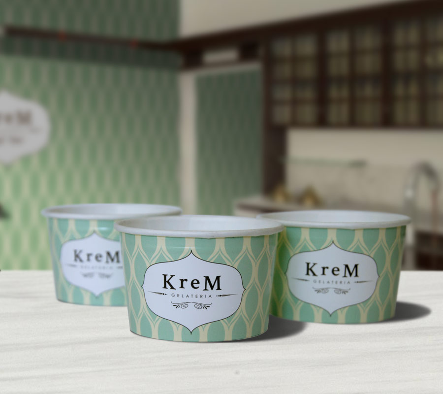
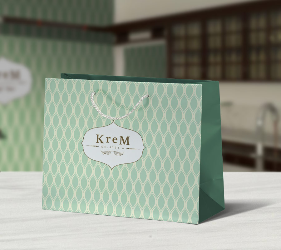
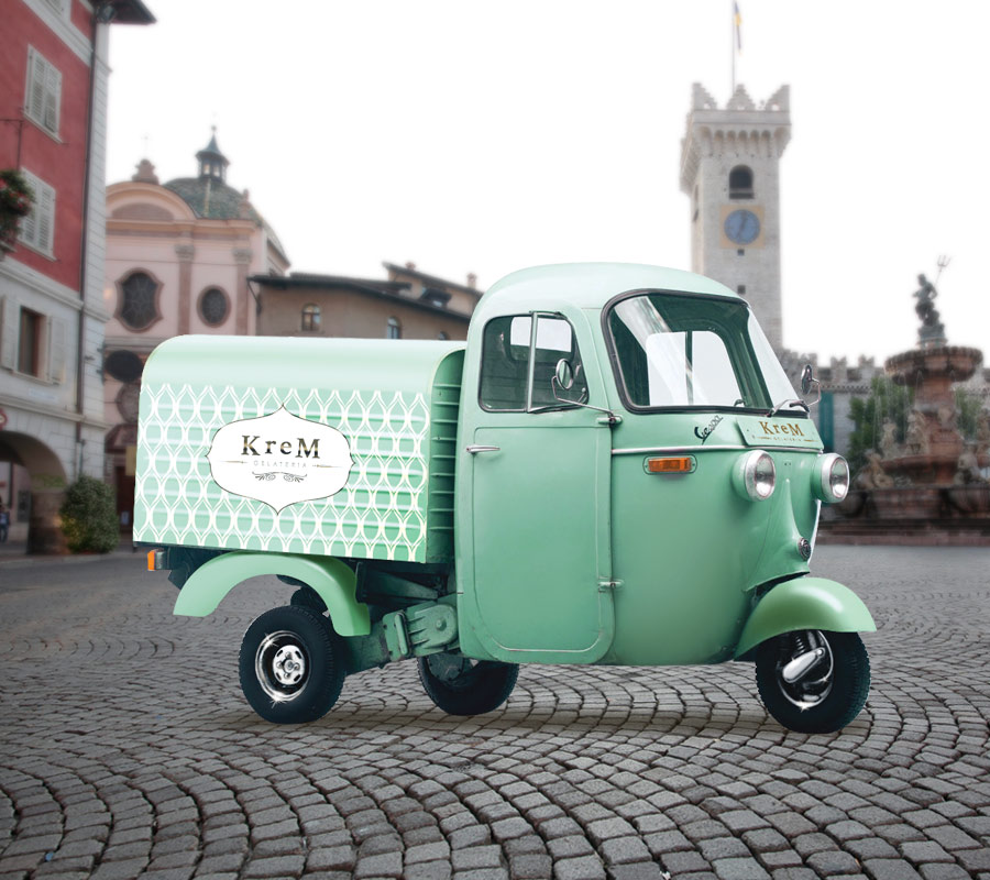
The choice of the name, Krem, and the soft colours, is a reminder of the softness of an ice-cream. For this ice-cream shop in Italy, I took care of the whole corporate graphics and image, starting from the paper cups for the ice-cream. Imitating the shop’s 1900s style, I came out with a wallpaper that became the theme of the ice cream shop itself. I suggested, then, to use an old Ape van to go around the city, using it as a advertising tool.
WHAT I DID
Brand Identity
Packaging
Menu
Advertising


